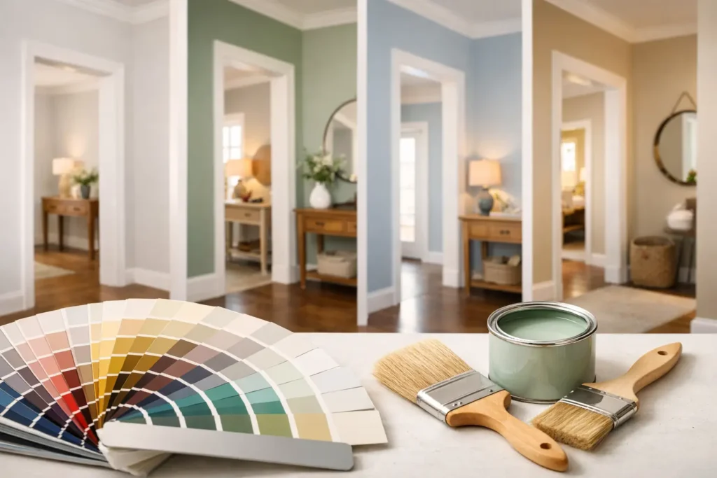

A hallway can make the whole house feel better – or slightly off – before you even step into the next room. That is why choosing the best paint colors for hallways matters more than people expect. These in-between spaces are often narrow, dim, busy, and easy to ignore, but the right color can make them feel brighter, calmer, and more connected to the rest of your home.
Hallways are also tricky because they rarely have ideal lighting. Some get no natural light at all, while others change tone dramatically from morning to night. Add doors, trim, flooring, family traffic, and scuff marks, and suddenly a color that looked lovely on a paint chip can feel completely wrong on the wall. The good news is that a few dependable color families work especially well here, and they can be adapted to almost any style or budget.
How to choose the best paint colors for hallways
Before picking a shade, think about what your hallway needs most. If it feels dark, you probably want a color that reflects light and keeps the space open. If it feels bland or overly long, a deeper or richer color can give it shape and personality. And if your hallway connects several rooms, the paint should help those spaces feel related rather than disconnected.
Undertones matter here more than many homeowners realize. A white with a cool blue undertone can feel crisp in one home and flat in another. A greige can look warm and cozy beside wood floors, then suddenly pull purple near gray carpeting. Sample colors on more than one wall and check them morning, afternoon, and evening. Hallways tend to exaggerate undertones because light is limited and directional.
The finish matters too. In a high-traffic hallway, flat paint can be hard to keep clean. Eggshell or satin is often the sweet spot – easy enough to wipe, but not so shiny that every bump and patch in the wall shows up.
12 best paint colors for hallways
1. Warm white
A warm white is one of the safest and most versatile choices for a hallway. It brightens the space without feeling stark, and it works especially well in homes that already have beige, cream, wood, or warm metal finishes. If your goal is to make a narrow hallway feel open and clean, this is a strong place to start.
The trade-off is that some warm whites can read yellow if the lighting is poor. Look for one with a soft, balanced base rather than a heavy buttery tone.
2. Soft greige
Greige sits right between gray and beige, which makes it useful when your home has a mix of warm and cool elements. It feels calm, current, and easy to live with. In hallways, soft greige gives you more depth than white without making the walls feel heavy.
This is a great choice if your hallway connects rooms painted in different neutrals. It helps bridge the gap in a way that feels intentional.
3. Light taupe
Light taupe brings warmth and a slightly cocooning effect, which can make a hallway feel more designed and less forgotten. It pairs beautifully with white trim, black accents, and natural textures like jute runners or wood frames.
If your hallway is very small and gets little light, go lighter than you think. Taupe can get muddy fast in shadowy spots.
4. Pale mushroom
Mushroom tones have a soft, earthy quality that feels relaxed and lived in. They are especially pretty in homes with vintage touches, layered neutrals, or cozy traditional style. A pale mushroom hallway can feel subtle but still richer than standard builder beige.
This color family is forgiving too, which helps in spaces where fingerprints and scuffs are part of daily life.
5. Dusty sage
If you want color but still want your hallway to feel restful, dusty sage is a lovely option. It has enough personality to stand out, but it still behaves almost like a neutral. It works beautifully with white trim, brass hardware, and natural wood.
Sage is especially helpful in hallways that feel stale or lifeless. It adds softness and freshness without shouting for attention.
6. Muted blue-gray
A muted blue-gray can make a hallway feel cool, airy, and polished. It is a nice fit for coastal, classic, or modern homes, especially if adjacent rooms already lean blue or gray. In the right light, it feels clean and elegant.
The caution here is temperature. In a dark hallway, blue-gray can feel chilly. Balance it with warm lighting, warm flooring, or creamy trim.
7. Soft blush beige
This one surprises people, but a blush-beige neutral can be beautiful in a hallway. It adds warmth and a subtle flattering glow that standard beige sometimes lacks. It still reads neutral, just softer and more welcoming.
This works best when the pink undertone is very restrained. Think barely-there warmth, not a rosy statement wall.
8. Charcoal green
For a hallway with decent lighting or a naturally dramatic feel, charcoal green can look incredibly stylish. It adds depth, richness, and a little mood while still feeling grounded and livable. In older homes, it can highlight architectural details beautifully.
Darker hallway colors are not automatically a bad idea. If the space already feels enclosed, leaning into that with a moody shade can make it feel intentional rather than awkward. Just pair it with lighter trim, good bulbs, or artwork so it does not feel flat.
9. Deep navy
Navy is classic, bold, and surprisingly flexible. It can make a hallway feel tailored and memorable, especially with white trim and warm wood floors. If your style leans a bit more dramatic but still timeless, navy is a strong contender.
Like any deep shade, it will show dust and wall imperfections more than a mid-tone neutral. Still, if you want your hallway to have presence, navy delivers.
10. Creamy beige
Creamy beige is one of the easiest colors to live with, especially in family homes. It is warm, forgiving, and unlikely to clash with nearby rooms. If you want a paint color that feels safe but not boring, this is often a better choice than plain tan.
It also works well for renters or first-time homeowners who want something broadly appealing and easy to style around.
11. Pale gray-green
Gray-green sits in that sweet spot between airy and earthy. It feels quiet, elegant, and slightly fresh without becoming trendy in a way that dates quickly. In hallways, it can soften harsh lines and make the transition between rooms feel gentler.
This is a smart option if you want subtle color but are tired of beige and white.
12. Soft clay neutral
A soft clay neutral has a muted warmth that feels cozy and current. It can bring life to a hallway that feels too plain, especially in homes with lots of white walls elsewhere. Think of it as a grounded, earthy neutral with a little more soul.
This color works particularly well with woven textures, oak tones, and warm metals. If your home style leans relaxed and natural, it can be a beautiful fit.
Best hallway paint colors by hallway type
A dark hallway usually benefits from warm whites, creamy beige, soft greige, or pale mushroom. These shades bounce light around and help the space feel less closed in. Cool, icy colors can sometimes make darkness more noticeable, so warmer neutrals are often easier to live with.
A long hallway has a bit more flexibility. You can lighten it to make it feel open, or use a richer shade like dusty sage, charcoal green, or navy to give it rhythm and character. If the hallway feels endless, color can actually help break up that tunnel effect.
A busy family hallway needs something practical as much as pretty. Mid-tone neutrals tend to hide wear better than bright white walls. Taupe, greige, mushroom, and gray-green all earn their keep here because they soften scuffs and still look styled.
If your hallway is open to a stairway or visible from the main living area, think about flow. The best choice may not be your favorite standalone color, but the one that makes your home feel cohesive from one space to the next.
Common mistakes to avoid
One common mistake is choosing a paint color based only on a large, bright room. Hallways behave differently. The same color often reads two shades darker there, so test carefully.
Another mistake is ignoring your trim and door color. Hallways have a lot of architectural interruption, and the wall paint needs to work with all of it. A soft wall color can look fresh with crisp white trim, while a moody color may need warmer whites to avoid harsh contrast.
It also helps to think beyond paint. Better lighting, a runner, art, and mirrors can all support the color choice. Paint does a lot of the work, but it does not have to do all of it alone.
A simple way to decide
If you are torn between several shades, start by asking one practical question: do you want your hallway to disappear quietly into the background, or do you want it to feel like part of your home’s style story? If you want it quiet, lean warm white, greige, beige, or mushroom. If you want more personality, sage, gray-green, navy, or charcoal green can bring the space to life.
At Everyday Home Style, we love choices that feel both pretty and doable, and hallway paint is exactly that kind of upgrade. A single gallon can change the mood of a forgotten space in a weekend.
The best hallway color is not always the lightest or trendiest one. It is the shade that makes your home feel a little more welcoming every time you walk through it.
Before You Buy Paint: Test Colors the Right Way
It is tempting to choose a paint color from a small swatch or a photo online, but hallways are one of the hardest places in a home to judge color accurately. Because they often have limited natural light and long stretches of uninterrupted wall, even subtle undertones can look very different once the paint is applied.
Before committing to a gallon of paint, buy sample pots of your top two or three choices. Instead of painting small patches, apply each color to a section of wall that is at least 2 feet by 2 feet. Larger samples give you a much more realistic idea of how the color will read across the space.
Take time to view each sample throughout the day. A shade that looks soft and inviting in the morning may appear darker or cooler under evening lighting. If your hallway relies mostly on artificial light, be sure to check the colors with your regular light fixtures turned on as well.
Walk through the hallway from both directions and pay attention to how the color looks next to your flooring, trim, doors, and any artwork. Since hallways connect multiple rooms, the best paint color is usually one that creates a smooth transition rather than standing out for the wrong reasons.
Spending an extra day or two testing paint samples may feel like a small delay, but it is one of the simplest ways to avoid costly repainting and end up with a hallway that feels brighter, more cohesive, and comfortable
Final Thoughts From Experience
One thing I have learned over the years is that hallways deserve far more attention than they usually get. Because they connect every room in the house, they quietly influence how your entire home feels. Even when guests cannot explain why a home feels welcoming, the hallway often plays a bigger role than they realize.
Many homeowners assume the safest option is simply choosing the lightest white available. In practice, that is not always the best decision. A hallway with poor lighting, warm wood floors, or cream trim can look much more balanced with a soft greige, mushroom, or warm beige than with a bright white that feels cold or sterile.
I also encourage homeowners to think about the hallway as part of the overall journey through the house rather than as an isolated space. The most successful paint choices are usually the ones that create a smooth visual transition between rooms instead of competing for attention. A color that looks slightly understated on its own often becomes the perfect choice once the whole home is viewed together.
If I could offer just one piece of advice, it would be this: never choose a hallway paint color from a tiny paint chip alone. Buy sample pots, paint generous test areas on different walls, and live with those colors for a couple of days. Look at them in daylight, at night, with lamps on, and from both ends of the hallway. Spending a little extra time testing almost always leads to a result you will enjoy for years instead of wishing you had chosen differently.
The best hallway paint color is rarely the trendiest one. It is the one that makes your home feel brighter, more connected, and more comfortable every time you walk from one room to the next.
About the Author
Fher is an architect specializing in residential design and space optimization. With hands-on experience improving how homes function and feel, he shares practical insights to help homeowners create spaces that are both beautiful and livable.